They create atmosphere, support different ways of working and give visible expression to corporate culture. In an interview with Jutta Werner and Livia Stasik from the colour design and trend research agency zukunftStil, we explore the impact colours have in the office, which trends are currently shaping design, and why companies today are relying on bespoke colour schemes more consciously than ever before.
Colour as a strategic design element that boosts productivity
Why does colour design in the office play a greater role today than it did a few years ago?
Colours have a direct influence on our well-being, as they create an atmosphere, convey emotions and generate a sense of comfort and security. This is why colour plays such an important role, particularly in modern working environments. Offices today are significantly more diverse and complex in structure than they were a few years ago, because the way we work has fundamentally changed.
Working environments are increasingly being adapted to the different needs of employees and can promote concentration, creativity or relaxation through the targeted use of colour schemes.
At the same time, colour creates identity and character. Companies want to design spaces where employees feel a connection and where they can find themselves.
A well-thought-out colour scheme strengthens this sense of belonging and gives the office a distinctive personality. For colour is far more than a decorative design element: when used strategically, it gives spaces structure, orientation and expression.
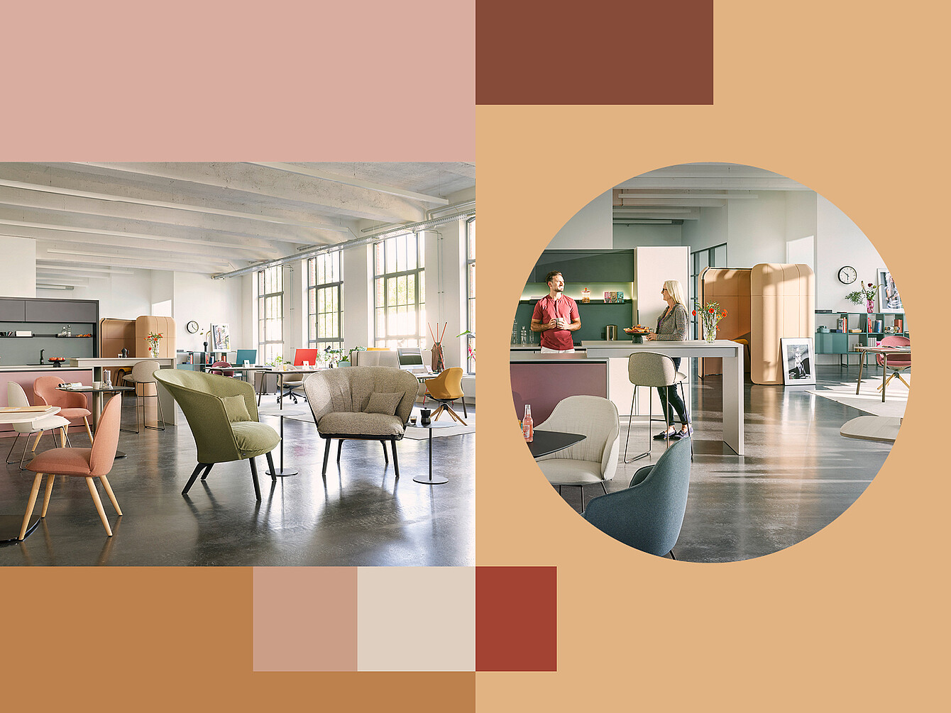
Whilst minimalist colour schemes were long regarded as synonymous with professionalism, the focus today is increasingly on creating spaces where people enjoy coming together, exchanging ideas and working creatively as a team. Colour plays a decisive role in creating this atmosphere and transforming offices into vibrant, inspiring workplaces where people can work productively.
Colour is a crucial building block of modern working environments – it boosts productivity, provides orientation and makes corporate culture visible.
Colour scheme in the office: light, materials and the right interplay
How can a coherent colour scheme be achieved without rooms appearing cluttered?
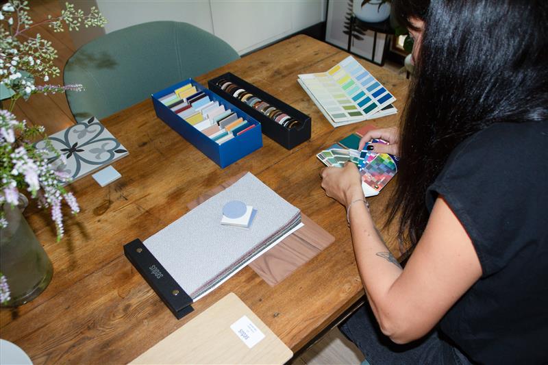
A coherent colour scheme is not created solely by the selection of individual shades, but above all through their consistent repetition across different materials and surfaces. This creates connections within the space that foster harmony and give colours a central role in the design concept. They do not appear in isolation, but run like a common thread through the entire working environment. At the same time, daylight plays a crucial role in how colours are perceived. Depending on the time of day, light intensity and the angle of light, shades change and constantly reveal new facets. Natural light brings colours to life, enhances contrasts and supports the desired atmosphere of a room in a completely natural way.
How can companies convey their brand identity and culture through colours in the office?
To do this, we first analyse the company’s identity and personality: what values are important, what does the company stand for, and what defines its culture? On this basis, we develop a bespoke concept that brings the brand to life authentically within the space. We do not rely on a flashy presentation, but instead subtly integrate the company’s colours, materials or design language into the scheme. This creates harmonious, bespoke working environments with a distinctive character that convey the company’s identity in a natural way. Each office thus becomes unique whilst simultaneously strengthening employees’ connection to the company. This promotes well-being and motivation, fosters a sense of appreciation and makes the workplace somewhere people enjoy coming to.
New Work needs spaces with identity. Colour helps to bring values, culture and working methods to life.
Colours in the office create orientation and structure
How can colours help to define different work zones – such as focus, creative or communication areas?
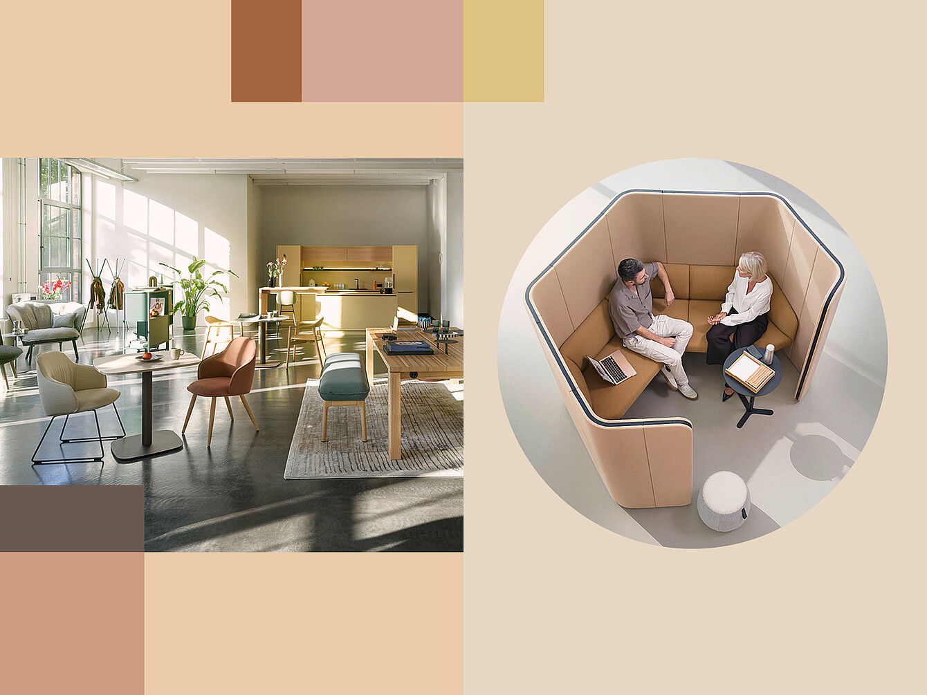
Colours can guide us through an office design when used strategically. Ideally, a colour-based guidance system intuitively shows us which area is best suited to which work requirement. Employees thus move automatically through different work environments and naturally choose the appropriate atmosphere. Particularly in large open-plan spaces, it is important to create distinct areas or demarcate them using colour without actually physically dividing the space.
Through deliberate colour schemes, zones for focused work, creative processes, or communication can be clearly defined. Clear, muted shades support focus and concentration, whilst intense and vibrant colours promote creative dynamism. Warm, lively shades, in turn, create communicative and inviting areas for exchange and collaboration. Colour thus not only serves an aesthetic function, but also acts as a guidance system within the space.
What impact do colours in the office have on well-being, concentration and productivity?
Colours often have an unconscious effect, yet they significantly shape the atmosphere of a room and, consequently, the behaviour and feelings of the people within it. Each of these areas has its own colour scheme.
- Well-being is created through soft and warm colours, natural harmonies and low contrast. This conveys a sense of security, reduces stress and creates a relaxed atmosphere.
- Concentration is better supported by fresh colours and subtle contrasts. These promote focused work and help to reduce visual stimuli.
- Strong, confident and intense tones, as well as striking contrasts, foster creativity through a free and uninhibited atmosphere.
Modern office concepts therefore use colours strategically to distinguish different areas from one another atmospherically and tailor them optimally to their function. Each colour scheme can specifically support the respective task.
This is because colours have different psychological effects on people. Warm and intense shades activate and motivate, whilst soft and subtle shades tend to convey calm and balance
A well-thought-out colour scheme not only enhances the atmosphere but also supports concentration, creativity and collaboration.
What typical mistakes do you encounter when planning a colour scheme?
Firstly, it is usually not enough to simply transfer corporate colours one-to-one into a spatial concept. Whilst CI colours work very well in a logo or in graphic communication, they do not, on their own, create a tangible identity or atmosphere within a space.
A coherent colour scheme only emerges through the deliberate use of primary, secondary and accent colours, as well as through the appropriate combination with materials, light and surfaces.
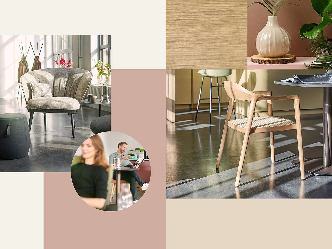
There is also often a lack of courage to integrate natural materials and warm wood tones into modern office concepts. Yet the design of today’s working environments is increasingly inspired by the home. Spaces are allowed to feel more homely, emotional and human without losing their functionality.
New demands from hybrid working environments
What colour trends are you currently observing in modern working environments?
Offices are increasingly being designed with intense colour tones. Even in natural colour schemes, strong accents are now being deliberately introduced. The courage to use colour has now reached the workplace as well.
Four defining colour trends are currently emerging that will significantly influence the design of modern workplaces in the coming years.
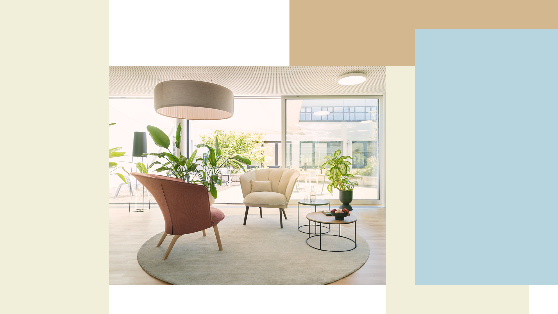
The focus is initially on a warm, natural colour palette. Earthy green and olive tones create a sense of calm and a connection to nature, complemented by accent colours such as burgundy, warm reds or butter yellow. This results in harmonious, inviting spaces with a homely and emotional feel. Light blue is also gaining in importance and is frequently combined with beige, light wood surfaces or soft green tones, creating calm yet modern atmospheres.
Another significant influence stems from 1970s design. This trend, originally firmly rooted in interior and living spaces, is now finding its way into office design, where it is being creatively reinterpreted. Characteristic features include spacious seating areas, organic shapes and bold colours such as mustard, burgundy or dark wood tones. This colour palette is complemented by materials such as coloured marble, which lend the rooms expressiveness and individuality.
A third trend revolves around the combination of concrete-look finishes, silver surfaces and soft pastel shades. It is precisely the interplay of hardness and softness that creates an atmosphere conveying both clarity and tranquillity. Bright, colourful shades meet grey and white tones, creating modern spaces that promote focused work whilst radiating a sense of human warmth.
Furthermore, a trend is emerging towards particularly intense and unusual colour combinations. Bold colours are deliberately used to create strong contrasts and symbolise courage, diversity and optimism. Ultramarine blue meets purple, rosé meets deep red: combinations that were once considered unusual now lend spaces individuality, energy and a strong design identity.
Colours give working environments character and create the emotional connection that modern corporate culture needs today.
The future of colour design in the office
What developments do you expect to see in the future regarding colour design in modern work environments?
I would like to see more courage, more individuality and an even stronger focus on people and their needs. Spaces are increasingly being designed with emotion in mind and specifically geared towards supporting well-being, a sense of belonging and different ways of working. Concepts should also be thought of holistically. It is often the small details that have a powerful impact. Coloured chair legs or table tops can make a difference and give rise to a unique concept.
Instead of ‘white on white’, office landscapes with personality should be developed. Colour is a powerful tool that must no longer be underestimated, but must be considered right from the start of an office concept.
What recommendations do you give to companies wishing to redesign their office colour scheme?
Companies wishing to redesign their office colour scheme should first take a close look at their own values, their corporate culture and the needs of their employees. Colour should not merely be used for decorative purposes, but should specifically reflect the company’s identity and support the desired working atmosphere.
It is also important to consciously divide spaces into different zones. Colour schemes can help to clearly define areas for concentration, communication, creativity or retreat without having to physically partition the space. This creates working environments that are both functional and atmospheric.
It is equally crucial to take employees into account and, ideally, even involve them in the design process.
After all, they are the ones who work in these spaces every day. If needs and working methods are taken into account at an early stage, authentic concepts emerge that are widely accepted and have a long-term impact.
Companies should also have the courage to rethink colour and make deliberate accents. It is often small details, materials or unusual colour combinations that give a space character and transform a standardised office space into a unique working environment.
The office of the future is not colourless. It uses colour deliberately to inspire people, connect them and make them productive.
If you could name just three basic rules for a successful colour scheme – what would they be?
Be bold with colour
Bold colour choices give spaces personality and prevent interchangeable, sterile working environments.
Understand your own identity and translate it into design
Companies should analyse their values, culture and desired impact, and translate these specifically into colours, materials and moods. This creates spaces with a genuine identity and recognisability.
Combine colours harmoniously
The interplay between main tones, secondary tones and accent colours is crucial. Only the right balance creates depth, tension and a harmonious atmosphere.
In modern workplaces, colour schemes in the office have long been more than just a design detail. They influence atmosphere, orientation and well-being – and help to make corporate culture a tangible experience within the space. Those who use colour consciously and consider it from the outset create workspaces with personality: functional, inspiring and tailored to the people who work there every day.

About the Interviewees: Jutta Werner and Livia Stasik
Jutta Werner and Livia Stasik are colour designers, trend experts and founders of the colour and trend agency zukunftStil in Hanover. Since 2012, they have been developing colour concepts, collections and design strategies for companies in the fields of interior design, product design, and material and colour design.
With their expertise in colour, trends and design, they support companies in making their identity visible and developing individual design concepts.
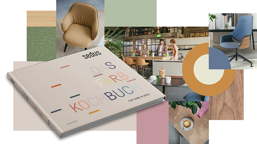
For Sedus, they oversaw the development of the colour scheme and, based on an extensive trend panel, identified four forward-looking trend worlds for office design. The results gave rise to practical tools such as a Colour Cookbook, mood boards and recipe cards, which showcase inspiring combinations of colour, material and textiles. The trend worlds were presented at the ORGATEC trade fairs in 2018, 2022 and 2024 and were used in the company’s showrooms and international communication campaigns.
Related posts
Colour with impact: How Jutta Werner from Zukunftstil is helping to shape the world of work
Mindful Work: How Colours and Materials Stabilise Focus
The role of colours, light and sensory experiences in interior design – A conversation with Carlotta Berta

social media channels: