Focus needs protection—but not isolation
Research consistently shows that distraction is the greatest obstacle to productivity in the workplace. Conversations, movement, and digital interruptions continuously fragment attention.
The intuitive response is clear: create more shielding.
And indeed, many workplaces now incorporate:
- acoustically enclosed rooms
- dedicated focus pods
- visually reduced workstations
However, a common mistake lies in overcorrection. Spaces that are too isolated do not just eliminate distraction—they also remove essential points of orientation.
Why silence alone is not enough
The answer lies in the concept of peripersonal space—the immediate sensory field surrounding the human body.
It acts as a kind of internal navigation system:
- interpreting proximity and distance
- providing a sense of safety and control
- stabilising attention
When this system is deprived of meaningful stimuli—such as in sterile or overly minimal environments—the result is not deeper focus, but rather disorientation, fatigue, and cognitive instability.
Focus, therefore, requires not fewer stimuli—but the right ones.
Three design principles for focused environments
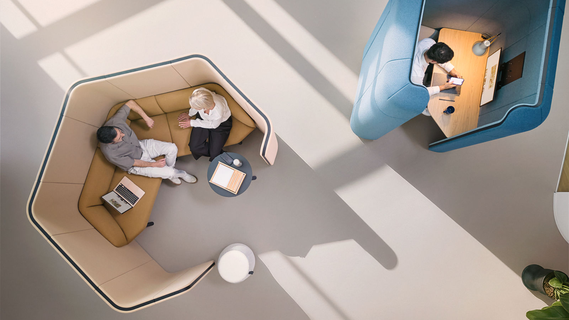
1. Graduated shielding instead of “all or nothing”
A compelling example can be found in the concept of cognitive zoning, as implemented in projects such as Tetra Pak.
Here, spaces are organised not by function, but by levels of sensory stimulation.
- High stimulation: social spaces, work cafés
- Moderate stimulation: semi-enclosed work areas
- Low stimulation: quiet focus zones
- Minimal stimulation: enclosed rooms for deep work
In Tokyo, this principle is expressed with particular clarity:
focus workstations are positioned along the façade, oriented outward—visually calm, yet not isolated.
Insight:
Effective shielding operates as a gradient, not a boundary.
2. Micro-architectures instead of one-size-fits-all layouts
A second example is provided by the Gruppo CAP headquarters, where the traditional desk has been replaced by a network of specialised environments.
Instead of fixed workstations, the space offers:
- enclosed rooms for intensive tasks
- quiet niches along circulation paths
- semi-private seating areas for short focus sessions
- library spaces for collective concentration
Notably, many of these environments are not isolated at the periphery, but integrated into the spatial flow.
Insight:
Focus often emerges not in separation, but in well-positioned retreat spaces within the overall environment.
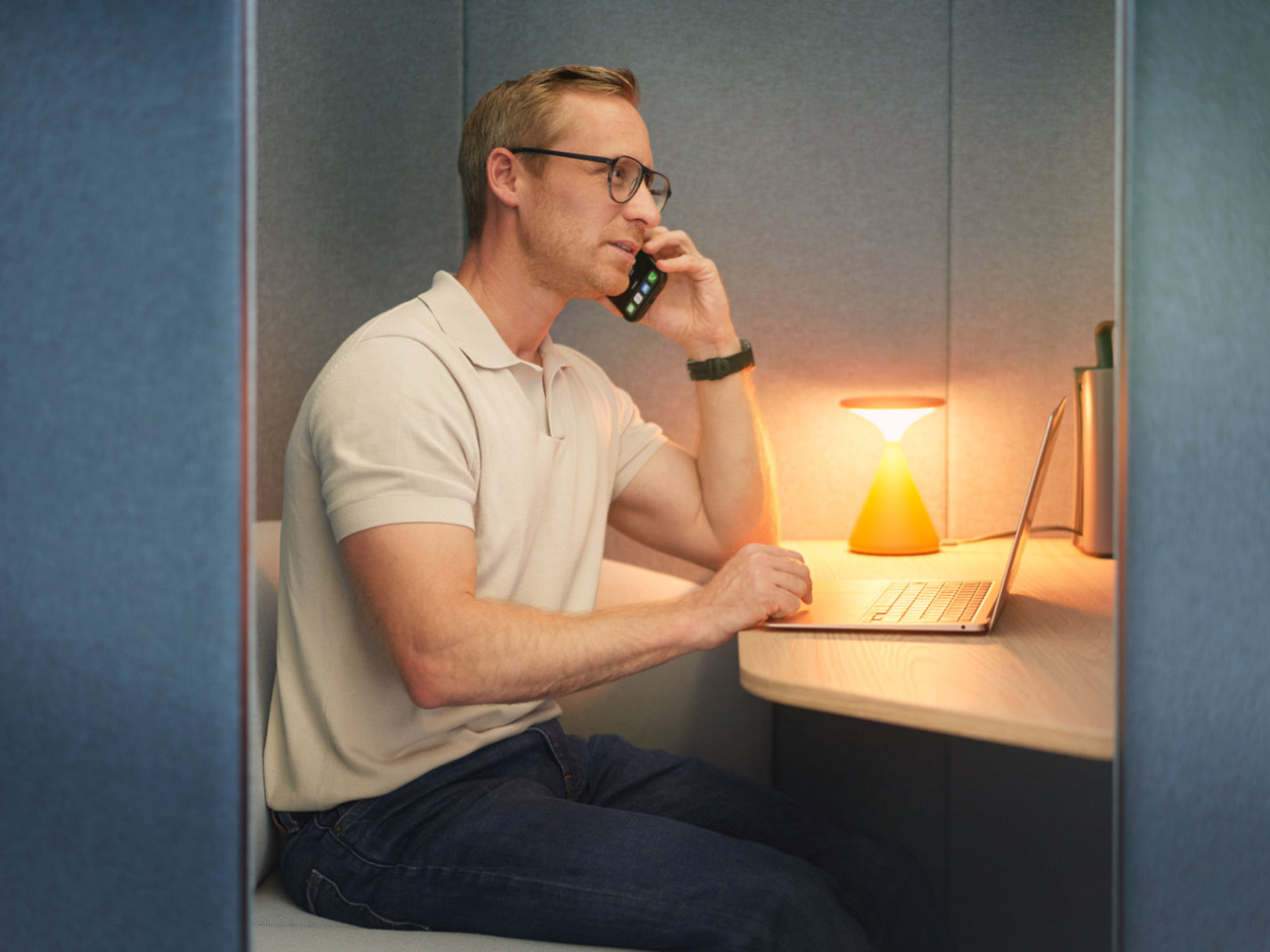
3. Sensory quality over mere reduction
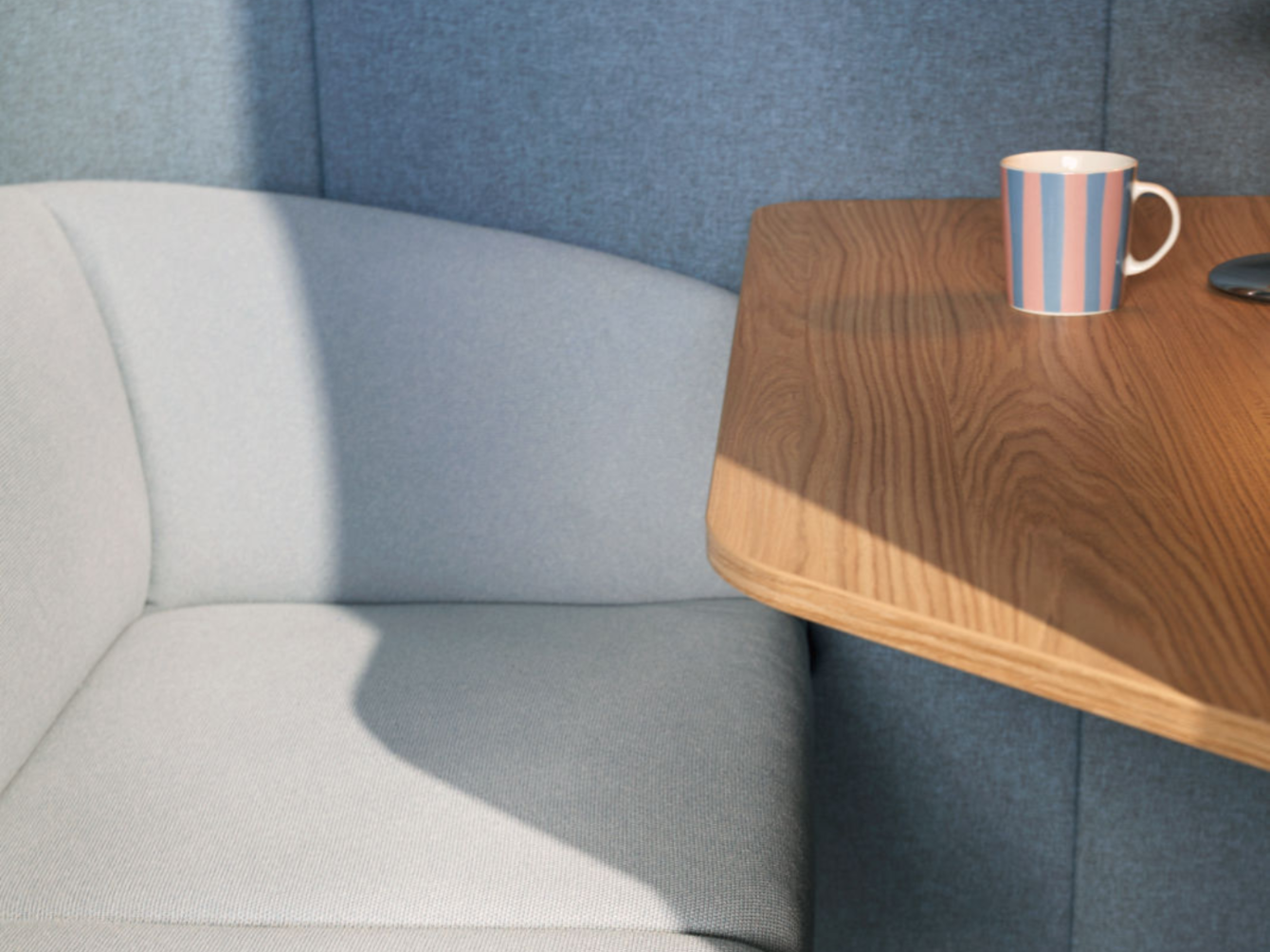
A more nuanced approach is demonstrated in the Ford Otosan project, where concentration is understood as a multisensory condition.
Design strategies include:
- matte surfaces to reduce visual noise
- soft, ambient lighting
- sound-absorbing materials
- calm, neutral colour palettes
These are complemented by:
- clear spatial hierarchies
- smooth transitions between zones
- tactile materials that enhance a sense of grounding
Insight:
It is not the absence of stimuli that matters—but their coherence.
The underestimated value of shared focus spaces
A particularly compelling development is the re-emergence of collective concentration.
Library-inspired environments, such as those at Start it @KBC, illustrate how this can work:
- open yet quiet settings
- implicit behavioural rules (no calls, no distractions)
- warm materials and natural elements
- semi-enclosed niches for individual retreat
These spaces operate almost intuitively:
simply entering them triggers a shift in mental state.
Insight:
Focus is not purely individual—it can also be shaped by shared spatial codes and atmospheres.
Transitions matter
An often overlooked aspect of workplace design is the journey between spaces.
High-performing environments provide:
- gradual transitions rather than abrupt changes
- intermediary zones for cognitive adjustment
- freedom of choice depending on task and state of mind
In projects such as Tetra Pak, even access points are differentiated, allowing users to enter directly into the environment that matches their intended activity.
Insight:
Focus does not begin in the room—it begins on the way there.
Conclusion: The right amount of shielding is a matter of balance
Designing for deep focus is not a binary challenge.
It is not about open versus closed.
It is not about silence versus activity.
It is about a carefully orchestrated balance of:
- protection
- sensory quality
- spatial diversity
- and individual choice
In other words:
The best focus space is not the quietest one—
but the one in which people feel oriented, grounded, and fully present.

social media channels: